


|
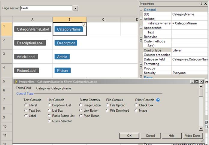
Although the Quick Selector table control looks similar to generic table controls, not all layout or code customizations for generic table controls are appropriate for the Quick Selector table control. A Quick Selector table control executes a query with a SELECT DISTINCT clause to get a list of unique row items to display. By default these items will be assigned to the text property of QuickSelectorItem using the Formula SelectorTableControl.GetQuickSelectorDisplayText.
Note, that if items to be selected are not primary keys of the table, no primary key will be included by default in the Quick Selector’s records. For example, if you have a list of Countries to select from, which is populated from the Customers table, no primary key will be included in the Quick Selector item. Such design ensures that you will get only unique countries in the list, while in the underlying table there might be thousands of records with the same country.
If the Quick Selector items are not primary keys of the table, then you may not use controls which require a primary key in the Quick Selector’s row. This includes controls such as images, row edit, delete and show buttons, any controls with pop-up such as large text fields or child panels. To allow the use of these controls you may also drag and drop a Primary Key field from the Toolbox. You may set the visible property for this field to False on the Property Sheet to hide it, but the Quick Selector results set will change to include every row of the underlying table.
It is possible to use a formula in the Quick Selector page in a similar way that it is used everywhere else with one important limitation: any database field included in the formula should be included in the query for the Quick Selector as well. So for example, if a QuickSelector has only EmployeeID in the query and you want a formula to use First and Last names, you must configure the data source to include thise fields.
Step 1: In the Property Sheet, open the TableControlQuery.
Step 2: In the Query Wizard, go to the “SELECT” step.
Step 3: Select “Manually select fields”.
Step 4: Include EmployeeID, FirstName, and LastName.
You can also populate Quick Selector pages using other database tables or views. For example, suppose you have a Quick Selector button that shows rows from the Products table. To make the Quick Selector display rows form from the Current Product List view, you must do the following:
Step 1: Select the Quick Selector button in the Layout Editor and specify the “Pop-up file path” property to be:
../Current-Product-List/ Current-Product-List-QuickSelector.aspx
Step 2: Set the Index field property to be “Current Product List.ProductId”.
Step 3: Specify the “Display text” property to be
=Current_Product_List.ProductName
The “Display text” formula sets the display text on each row on the Quick Selector page and the Quick Selector button text.
Once you make changes on a Quick Selector page, all Quick Selector buttons which redirect to this Quick Selector page will show you the new effect. If you only want certain Quick Selector buttons to be affected, you can duplicate the Quick Selector Page, change the copy according to your needs, and set the Quick Selector button’s “Pop-up path” property to be the new path.
You can change another control type to a Quick Selector via the “Control type” property in the Property Sheet. Do not forget to also specify the relative URL to the QuickSelector ASPX file in the Pop-up file path mentioned above.
Resizing Quick Selector pages
To resize all quick selectors globally in the application, you should define the following CSS classes in Style.css which will override the classes in BaseStyles.css.
|
CSS class name |
Description |
Default values |
Example of new values |
|
.QSSize |
Size of pop-up. |
height: 278px; |
height: 478px; |
|
.QSttc div |
Width of the quick selector cell content before truncation. |
width:290px; |
width:580px; |
|
.QSfooter |
Top position of the footer. |
top:240px; |
top:440px; |
|
.QSContainer .QSscrollRegion |
Height of the scroll region. |
height:200px; |
height:400px; |
To resize individual quick selector page, define new CSS classes in Style.css as above. However, instead of override the existing CSS classes in BaseStyle.css, you give the CSS classes new names such as .QSSize1, .QSttc1 div, .QSfooter1, .QSscrollRegion1. Then you must modify the Quick Selector page to use the new classes.
Step 1: In the Property Sheet, set the “Pop-up CSS class” property to be the new class such as “QSSize1”:
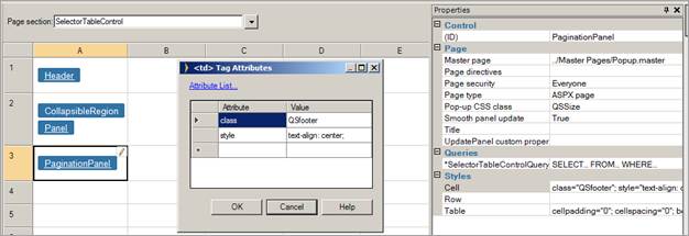
Step 2: Go inside the SelectorTableControl, select the cell with PaginationPanel and set the cell attribute to be class=QSfooter1:
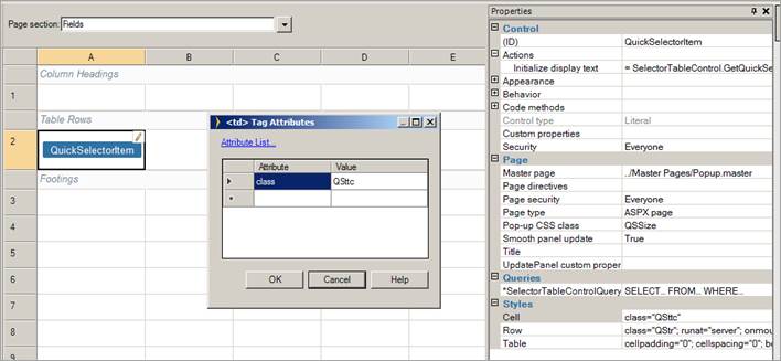
Step 3: Now go inside the SelectorPanel in the SelectorFields and select the cell with QuickSelectorItem. Select the cell attribute and change QSttc to QSttc1:
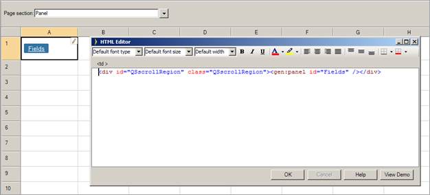
Step 4: Finally go to the Panel level and change the class attribute to your new value QSScrollRegion1:
Note: When the text direction is set to Right-to-left and the HTML Editor is used on a page, the display position of the QuickSelector is not correct. You can resolve this issue by using a different editor from the available options, such as CKEditor.