


|
Modern Theme Example: Customizing the Data Grid Styles
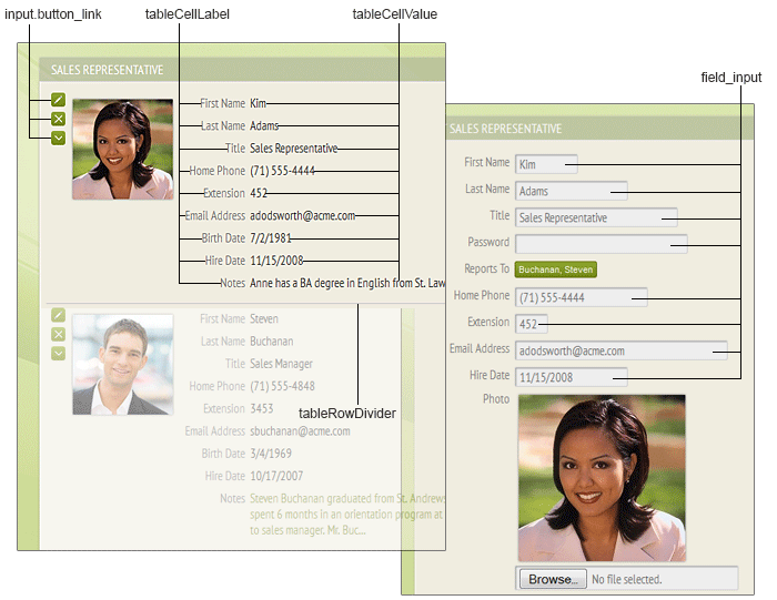
The data grid (show/edit table panel, show/edit record panel) is used to display the data within your application. Each record occupies a row in the panel, and is composed of field label/value pairs arranged in one or more columns (configurable). Additionally, there are buttons to edit, delete, and show/hide child record(s) associated with each particular record. These styles control the look-and-feel of the data grid:
/* existing definition in BaseStyles.css */
input.button_link { /* table row button */
background: -moz-linear-gradient( center top, #8ea82a 5%, #758410 100% );
background: -webkit-gradient( linear, left top, left bottom, color-stop(0.05, #8ea82a), color-stop(1, #758410) );
background: -ms-linear-gradient(top, #8ea82a 5%, #758410 100%);
border: 1px solid #5b660c;
border-radius: 3px;
display: inline-block;
filter: progid:DXImageTransform.Microsoft.Gradient(startColorStr='#8ea82a', endColorStr='#758410');
padding: 4px;
}
input.button_link:hover { /* table row button hover state */
background: -moz-linear-gradient( center top, #8e1f1f 5%, #c91212 100% );
background: -webkit-gradient( linear, left top, left bottom, color-stop(0.05, 8e1f1fa), color-stop(1, #c91212) );
background: -ms-linear-gradient(top, #8e1f1f 5%, #c91212 100%);
border: 1px solid #fafafa;
/* box-shadow: 0px 0px 0px 1px #e7d5bc; */
filter: progid:DXImageTransform.Microsoft.Gradient(startColorStr='#8e1f1f', endColorStr='#c91212');
-moz-transition: all 0.2s ease-in-out 0s;
}
.tableCellLabel {/* table cell field label text */
color: #777777;
font-family: 'PT Sans Narrow', Arial, Verdana, Georgia, sans-serif;
font-size: 15px;
padding-bottom: 0px;
padding-left: 6px;
padding-right: 2px;
padding-top: 8px;
text-align: right;
text-transform: none;
vertical-align: top;
white-space: nowrap;
}
.tableCellValue { /* table cell field value text */
color: #333333;
font-family: 'PT Sans Narrow', Arial, Verdana, Georgia, sans-serif;
font-size: 15px;
padding-bottom: 0px;
padding-left: 4px;
padding-right: 4px;
padding-top: 8px;
text-align: left;
vertical-align: top;
}
.field_input, .fi { /* input textbox */
background-color: #eeeeee;
border: 1px solid #cccccc;
border-radius: 2px;
box-shadow: inset 1px 1px 1px #999999;
color: #666666;
font-family: 'PT Sans Narrow', Arial, Verdana, Georgia, sans-serif;
font-size: 15px;
padding-left: 4px;
padding-top: 2px;
vertical-align: top;
}
.tableRowDivider { /* table row divider between consecutive records */
border-bottom: 1px solid #cccccc;
height: 1px;
}
For the show table panel (left-hand portion of the image above), let’s start by modifying the background gradient of the edit/delete/expand/collapse buttons.
/* existing definition in BaseStyles.css */
input.button_link { /* table row button */
background: -moz-linear-gradient( center top, #8ea82a 5%, #758410 100% );
background: -webkit-gradient( linear, left top, left bottom, color-stop(0.05, #8ea82a), color-stop(1, #758410) );
background: -ms-linear-gradient(top, #8ea82a 5%, #758410 100%);
filter: progid:DXImageTransform.Microsoft.Gradient(startColorStr='#8ea82a', endColorStr='#758410');
…
}
input.button_link:hover { /* table row button hover state */
background: -moz-linear-gradient( center top, #758410 5%, #8ea82a 100% );
background: -webkit-gradient( linear, left top, left bottom, color-stop(0.05, #758410), color-stop(1, #8ea82a) );
background: -ms-linear-gradient(top, #758410 5%, #8ea82a 100%);
filter: progid:DXImageTransform.Microsoft.Gradient(startColorStr='#758410', endColorStr='#8ea82a');
…
}
Note that the four gradient attributes account for the various browsers currently in use: “-moz-linear-gradient” for Firefox, “-webkit-gradient” for Chrome and Safari, “-ms-linear-gradient” for IE10, and “filter: progid” for IE8-9.
For example, let’s make the buttons reddish instead (with “start” color #c91212, and “end” color #8e1f1f):
/* new definition in Styles.css */
input.button_link { /* table row button */
background: -moz-linear-gradient( center top, #c91212 5%, #8e1f1f 100% );
background: -webkit-gradient( linear, left top, left bottom, color-stop(0.05, #c91212), color-stop(1, #8e1f1f) );
background: -ms-linear-gradient(top, #c91212 5%, #8e1f1f 100%);
…
filter: progid:DXImageTransform.Microsoft.Gradient(startColorStr='#c91212, endColorStr='#8e1f1f');
…
}
input.button_link:hover { /* table row button hover state */
background: -moz-linear-gradient( center top, #8e1f1f 5%, #c91212 100% );
background: -webkit-gradient( linear, left top, left bottom, color-stop(0.05, #8e1f1f), color-stop(1, #c91212) );
background: -ms-linear-gradient(top, #8e1f1f 5%, #c91212 100%);
filter: progid:DXImageTransform.Microsoft.Gradient(startColorStr='#8e1f1f ', endColorStr='#c91212');
…
}
Next, let’s reduce the font size of and padding around the field labels, and make them all uppercase and reddish; for the field values, let’s change their font family and size, and reduce the padding around them; also, let’s make the divider border dashed and reddish:
/* existing definition in BaseStyles.css */
.tableCellLabel {/* table cell field label text */
color: #777777;
font-family: 'PT Sans Narrow', Arial, Verdana, Georgia, sans-serif;
font-size: 15px;
padding-bottom: 0px;
padding-left: 6px;
padding-right: 2px;
padding-top: 8px;
text-transform: none;
…
}
.tableCellValue { /* table cell field value text */
color: #333333;
font-family: 'PT Sans Narrow', Arial, Verdana, Georgia, sans-serif;
font-size: 15px;
padding-bottom: 0px;
padding-left: 4px;
padding-right: 4px;
padding-top: 8px;
…
}
.tableRowDivider { /* table row divider between consecutive records */
border-bottom: 1px dotted #cccccc;
height: 1px;
}
/* new definitions in Styles.css */
.tableCellLabel {/* table cell field label text */
color: #8e1f1f; /* make field labels a lighter gray, overriding default attribute */
font-family: 'PT Sans Narrow', Arial, Verdana, Georgia, sans-serif;
font-size: 13px; /* reduce font size, overriding default attribute */
padding-bottom: 0px;
padding-left: 6px;
padding-right: 2px;
padding-top: 4px; /* reduce padding between fields, overriding default attribute */
text-transform: uppercase; /* make field labels uppercase, overriding default attribute */
…
}
.tableCellValue { /* table cell field value text */
color: #333333;
font-family: Georgia, sans-serif; /* change font family to Georgia, overriding default attribute */
font-size: 12px; /* reduce font size, overriding default attribute */
padding-bottom: 0px;
padding-left: 4px;
padding-right: 4px;
padding-top: 4px; /* reduce padding between fields, overriding default attribute */
…
}
.tableRowDivider { /* table row divider between consecutive records */
border-bottom: 1px dashed #8e1f1f; /* make divider border dashed and reddish */
height: 1px;
}
The resulting show table panel looks like this:

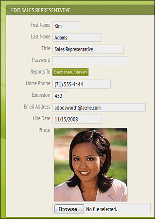
For the edit record panel (right-hand portion of the image above), let’s make the input textboxes more flat (i.e., reduce the 3D inner shadow effect), and the text darker:
/* existing definition in BaseStyles.css */
.field_input, .fi { /* input textbox */
background-color: #eeeeee;
border: 1px solid #cccccc;
border-radius: 2px;
box-shadow: inset 1px 1px 1px #999999;
color: #666666;
font-family: 'PT Sans Narrow', Arial, Verdana, Georgia, sans-serif;
font-size: 15px;
padding-left: 4px;
padding-top: 2px;
vertical-align: top;
}
/* new definition in Styles.css */
.field_input, .fi { /* input textbox */
box-shadow: none; /* remove inner shadow effect, overriding default attribute */
color: #000000; /* darken textbox text, overriding default attribute */
}
The resulting edit record panel looks like this: