The data grid is used to display the data within your application. It is comprised of a column header row and one or more rows of actual data, within each of which are buttons to show, edit, copy, and delete their respective record. These styles control the look-and-feel of the data grid:
For this example, we’ll only modify the default definitions (from the Andes page style) which specifically control the column header/row text; the row text, grid lines and padding; and the default, select (checked row), highlight (active row) coloring for the data rows (used in the Up/Down Keypress navigation).
First, let’s modify the default column header and link text:
.thc { /* column header container */
background-color: #e4f5d3;
border-bottom: 1px #cccccc solid;
border-right: 1px #cccccc solid;
color: #666666;
font-family: Verdana, Geneva, ms sans serif;
font-size: 10px;
font-weight: bold;
padding: 5px;
vertical-align: top;
}
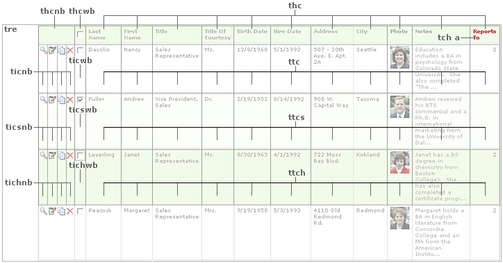
.thcnb { /* column header container (above row buttons) */
background-color: #e4f5d3;
border-bottom: 1px #cccccc solid;
color: #666666;
font-family: Verdana, Geneva, ms sans serif;
font-size: 10px;
font-weight: bold;
padding: 5px;
vertical-align: top;
}
.thcwb { /* column header container (above select checkbox) */
background-color: #e4f5d3;
border-bottom: 1px #cccccc solid;
border-left: 1px #cccccc solid;
border-right: 1px #cccccc solid;
color: #666666;
font-family: Verdana, Geneva, ms sans serif;
font-size: 10px;
font-weight: bold;
padding: 5px;
vertical-align: top;
}
.tch a { /* column header link text */
color: #888888;
font-family: Verdana, Geneva, ms sans serif;
font-size: 10px;
text-decoration: none;
}
The default styles render as:

Let’s change the column header’s background color to bright blue, the cells above the row buttons and checkbox to a light purple, the (sortable) link text to white, and regular text to orange (“Photo” and “Notes” are non-sortable column header text):
/* add new definitions to Styles.css */
.thc { /* column header container */
background-color: #0000ff; /* override default attribute */
color: #f8a403; /* override default attribute */
}
.thcnb { /* column header container (above row buttons) */
background-color: #aaaaff; /* override default attribute */
}
.thcwb { /* column header container (above select checkbox) */
background-color: #aaaaff; /* override default attribute */
}
.tch a { /* column header link text */
color: #ffffff;
}
Now the customized column header renders as:

Next, let’s modify the default row text color, grid lines, and padding:
.ttc { /* data grid data container */
padding: 5px;
color: #666666;
vertical-align: top;
font-family: Verdana, Geneva, ms sans serif;
font-size: 10px;
text-align: left;
border-right: 1px #cccccc solid;
border-bottom: 1px #cccccc solid;
background-color: #ffffff;
width: 400px;
}
.ticnb { /* data grid row button container */
background-color: #ffffff;
border-bottom: 1px #cccccc solid;
color: #444444;
padding-left: 1px;
padding-top: 5px;
vertical-align: top;
width: 16px;
}
.ticwb { /* data grid select checkbox container */
background-color: #ffffff;
border-bottom: 1px #cccccc solid;
border-left: 1px #cccccc solid;
border-right: 1px #cccccc solid;
color: #444444;
padding-top: 3px;
vertical-align: top;
width: 16px;
}
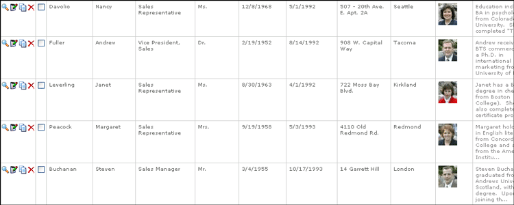
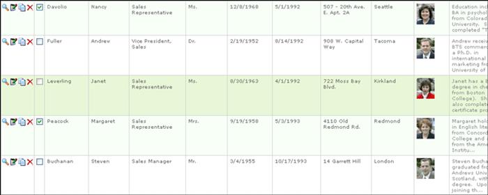
The default rows render as:
Now, let’s change the row’s text to green, its row button and checkbox cell grid lines to purple, its row data grid lines to bright blue, and increase the padding:
/* add new defintion in Styles.css */
.ttc { /* data grid data container */
border-bottom: 1px solid #0000ff;
border-right: 1px solid #0000ff;
color: #009900;
padding: 16px;
}
.ticnb { /* data grid row button container */
border-left: 1px solid #aaaaff;
border-right: 1px solid #aaaaff;
}
.ticwb { /* data grid select checkbox container */
border-left: 1px solid #aaaaff;
border-right: 1px solid #aaaaff;
}
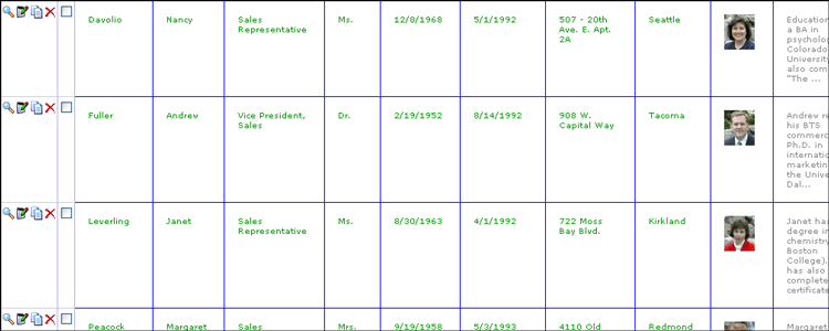
The customized rows render as:
Finally, let’s change the colors used for the default, select (checked row), highlight (active row) coloring for the data rows (used in the Up/Down Keypress navigation):
.ttc { /* data grid data container */
padding: 5px;
color: #666666;
vertical-align: top;
font-family: Verdana, Geneva, ms sans serif;
font-size: 10px;
text-align: left;
border-right: 1px #cccccc solid;
border-bottom: 1px #cccccc solid;
background-color: #ffffff;
width: 400px;
}
.ttch { /* data grid data container highlighted state */
padding: 5px;
color: #666666;
vertical-align: top;
font-family: Verdana, Geneva, ms sans serif;
font-size: 10px;
text-align: left;
border-right: 1px #cccccc solid;
border-bottom: 1px #cccccc solid;
background-color: #e4f5d3;
}
.ttcs { /* data grid data container selected state */
padding: 5px;
color: #666666;
vertical-align: top;
font-family: Verdana, Geneva, ms sans serif;
font-size: 10px;
text-align: left;
border-right: 1px #cccccc solid;
border-bottom: 1px #cccccc solid;
background-color: #f7fff0;
}
.ticnb { /* data grid row button container */
background-color: #ffffff;
border-bottom: 1px #cccccc solid;
color: #444444;
padding-left: 1px;
padding-top: 5px;
vertical-align: top;
width: 16px;
}
.tichnb { /* data grid row button container highlighted state */
background-color: #e4f5d3;
border-bottom: 1px #cccccc solid;
color: #444444;
padding-left: 1px;
padding-top: 5px;
vertical-align: top;
width: 16px;
}
.ticsnb { /* data grid row button container selected state */
background-color: #f7fff0;
border-bottom: 1px #cccccc solid;
color: #444444;
padding-left: 1px;
padding-top: 5px;
vertical-align: top;
width: 16px;
}
.ticwb { /* data grid select checkbox container */
background-color: #ffffff;
border-bottom: 1px #cccccc solid;
border-left: 1px #cccccc solid;
border-right: 1px #cccccc solid;
color: #444444;
padding-top: 3px;
vertical-align: top;
width: 16px;
}
.tichwb { /* data grid select checkbox container highlighted state */
background-color: #e4f5d3;
border-bottom: 1px #cccccc solid;
border-left: 1px #cccccc solid;
border-right: 1px #cccccc solid;
color: #444444;
padding-top: 3px;
vertical-align: top;
width: 16px;
}
.ticswb { /* data grid select checkbox container selected state */
background-color: #f7fff0;
border-bottom: 1px #cccccc solid;
border-left: 1px #cccccc solid;
border-right: 1px #cccccc solid;
color: #444444;
padding-top: 3px;
vertical-align: top;
width: 16px;
}
The default definitions render as:
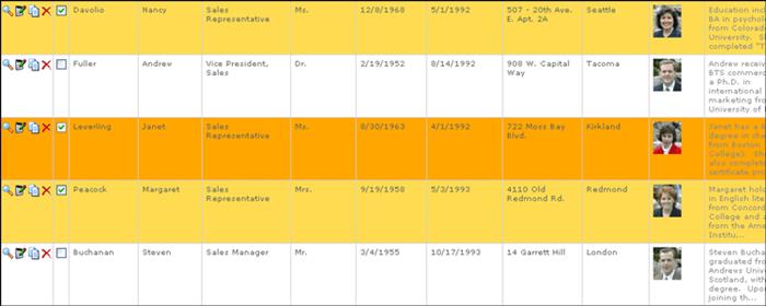
Let’s leave the row’s default color as white, but change its selected color to light orange and its highlighted color to bright orange:
/* add new definitions to Styles.css */.tichnb { /* data grid row button container highlighted state */
background-color: #f8a403;
}
.tichwb { /* data grid select checkbox container highlighted state */
background-color: #f8a403;
}
.ttch { /* data grid data container highlighted state */
background-color: #f8a403;
}
.ticsnb { /* data grid row button container selected state */
background-color: #fcdb57;
}
.ticswb { /* data grid select checkbox container selected state */
background-color: #fcdb57;
}
.ttcs { /* data grid data container selected state */
background-color: #fcdb57;
}
Now, the rows render as: