Enhancing applications with standard buttons that do standard things is often a tedious and time-consuming task. Iron Speed Designer can greatly simplify, and largely automate, this mundane task. For example, Iron Speed Designer supports four types of buttons. The Push Button, Link Button and Image Buttons create standard HTML buttons based on the Button, <a href> and <img> HTML tags. A fourth type of button supported by Iron Speed Designer is a button that is created using HTML layout. This button can be used by dragging an Include ASCX Component from the Toolbox onto your page.
You can create many different types of buttons using HTML layout and use them on your page. For example, you can create a Red button and a Green button and use them multiple times on a single page. The button panel file may contain the complete property settings for the button including the label text, the URL and the command to execute. By setting the button properties completely, the button actually becomes a specific button and not reusable to create multiple buttons with different labels, URLs and commands. To allow reusability, Iron Speed Designer supports the ability to set some properties of the button at the page or panel that incorporates the button.
To create a reusable button:
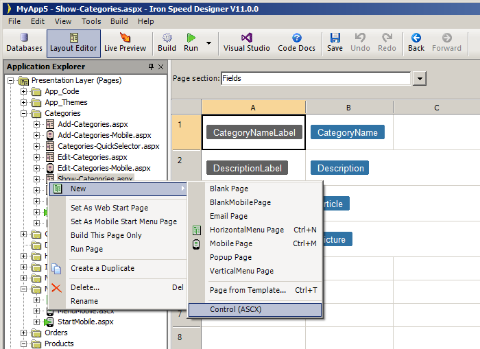
Step 1: Create a new ASCX control by right-clicking on any node on the Application Explorer. Rename this file to “RedButton.ascx”.
Step 2: Create a Link button within the newly created ASCX file. Select the first cell on the Layout Editor. In the HTML Editor enter:
“GEN:LINKBUTTON Name=“Button”/>“
Step 3: Set these <table> style attributes in the Tag Attributes dialog (Right-click, Styles, Table…).
cellpadding : 3
cellspacing : 0
border : 1
bordercolorlight : #C0C0C0
bordercolordark : #808080
style : border-collpas:collapse
bgcolor : #808080
Step 4: Set these <td> style attributes in the Tag Attributes dialog (Right-click, Styles, Cell…).
color : #FFFFFF
font-family: Verdana
font-size: 10px
Font-weight: bold
text-decoration: none
text-align: center
padding-left: 3px
padding-right: 3px
Step 5: Set the Control Type property via the Property Sheet. However, do not set the Text, ImageUrl or Button Action properties for the Button control.
|
Group |
Property |
Setting |
|
|
Control name |
Button |
|
Control |
Control type |
Button ASCX Panel |
|
Control |
Button actions |
Leave unset |
|
Appearance |
Text |
Leave unset |
|
Appearance |
ImageUrl |
Leave unset |
Step 6: Build the ASCX control (Build, Build).
Your button control is ready to use. To include this panel on a page:
Step 1: Use Application Explorer to open the page where you wish to add the new button panel.
Step 2: In Layout Editor, select the page area where you wish to add the button panel.
Step 3: Drag an Include ASCX Component from the Toolbox onto your page in the Layout Editor.
Step 4: In the Property Sheet for the newly added Include ASCX Component, select the ASCX panel:
|
Group |
Property |
Setting |
|
|
Control name |
Include |
|
Control |
ASCX file path |
RedButton.ascx |
|
Custom properties |
Button-CommandName |
Redirect |
|
Custom properties |
Button-Consumers |
Page |
|
Custom properties |
Button-Text |
My Button |
|
Custom properties |
Button-RedirectURL |
http://www.ironspeed.com |
Step 5: Build and run the application and review the buttons displayed.