This section contains all properties related to individual controls and also allows configuring actions, events and other business logic. You have to select control on the Layout Editor to see this section for the control.
|
Property |
Description |
||||||||||||||||||||||||||||||||||||||
|
(ID) |
Shows id (programmatic name) of the selected control and allows renaming it.
|
||||||||||||||||||||||||||||||||||||||
|
ASCX file path |
Specifies the location of the associated ASCX control to include.
|
||||||||||||||||||||||||||||||||||||||
|
Checked value |
The value saved into the database when a selected check box field is saved. “Checked value” is generally set to ‘Yes’. While “Checked value” can be set to anything, typical values are True, T, Yes, and 1.
|
||||||||||||||||||||||||||||||||||||||
|
Control type |
The type of the control to display. You can change control type for all generated fields.
|
||||||||||||||||||||||||||||||||||||||
|
Custom properties |
Additional user-defined properties passed through to the generated ASP.NET controls.
See Also |
||||||||||||||||||||||||||||||||||||||
|
Database field |
Designates from where the data is retrieved or saved. The database field to be displayed in the format: <TABLE>.<FIELD>
|
||||||||||||||||||||||||||||||||||||||
|
Date selector type |
The type of calendar date selector control displayed in date fields. A Date Selector control presents a calendar-like interface that lets application users select date values.
The calendar’s date format is determined by the “culture” attribute in your application’s Web.config file, e.g.: <globalization fileEncoding="utf-8" requestEncoding="utf-8" responseEncoding="utf-8" culture="en-US" . . . You can set the culture attribute on the Languages step in the Application Wizard.
|
||||||||||||||||||||||||||||||||||||||
|
Data source table |
Specifies a table which is used to populate data into this user interface control.
|
||||||||||||||||||||||||||||||||||||||
|
Depends on |
Select parent control to implement “make, model, year” dependancies. Only controls from the same table or from the parent table are applicable.
|
||||||||||||||||||||||||||||||||||||||
|
Enter key button ID |
ID of the button to execute when the “Enter” key pressed.
|
||||||||||||||||||||||||||||||||||||||
|
Editor type |
Specifies which text editor control to use.
|
||||||||||||||||||||||||||||||||||||||
|
File name field |
The companion database field containing the file name of an uploaded or downloaded file. Used for the File Download and FileUpload controls, this companion database field must be in the same table as the field containing the actual file contents. File Upload For File Upload, the file name of the uploaded file is stored in this field. The File Upload control displays a separate text box data entry field for entering a file name to upload into the database. File Download For File Download, the value of this field displays a file download link that when clicked opens (downloads) the file. The File Download control displays a clickable link to open (download) the file.
|
||||||||||||||||||||||||||||||||||||||
|
Hide until searched |
Controls whether the table’s data grid is initially displayed when the panel is rendered on the screen.
|
||||||||||||||||||||||||||||||||||||||
|
Increment / decrement buttons |
Specifies whether increment and decrement buttons are displayed.
Increment and decrement buttons are enabled by default if this property is not present. You must explicitely set this property to False if you do not want increment and decement buttons for the designated field. You can globally disable the generation of increment and decrement buttons in the Application Generation Options dialog (Tools, Application Generation Options...). If disabled globally in the Application Generation Options dialog, no increment and decrement buttons will be created anywhere in your application regardless of the “Encrement / decrement buttons” property setting for any individual control.
|
||||||||||||||||||||||||||||||||||||||
|
Ignore time when filtering dates |
If selected, performs a less precise comparison on date fields.
|
||||||||||||||||||||||||||||||||||||||
|
Initial row display style |
Specifies how to display table rows when a table panel is first displayed.
Note: After the page is initially displayed, application users may expand and collapse rows.
|
||||||||||||||||||||||||||||||||||||||
|
Maximum generated items |
The maximum number of database query values automatically populated in the control. This applies to list-style controls, such as dropdown lists and list boxes. The default value used by Iron Speed Designer is 500 entries. However, you can change this threshold to any value desired on a control-by-control basis with “Maximum generated items”. Note: If the number of entries at run-time exceeds the value of the “Large list selector threshold” property, a More link will be placed next to the field that, when clicked, displays the Large List Selector. If the “Large list selector threshold” is not specified, then “Maximum generated items” is used as the Large List Selector threshold. If you wish to disable the Large List Selector for a particular control, set “Large list selector threshold” to a very large value.
|
||||||||||||||||||||||||||||||||||||||
|
Number of columns |
Number of columns in gallery table control.
|
||||||||||||||||||||||||||||||||||||||
|
Number of rows |
The default number of data rows to display within the table at one time. Typically, this numeric value is displayed in the Pagination control associated with the table and can be adjusted at run-time by the application user. To get an unlimited number of records to be displayed on the page, set the Page Size to -1. Note, however, this will not work in applications where an Add Record, Edit Record, or Show Record page returns to the page containing the table and the table is refreshed. This creates a “page size” error.
|
||||||||||||||||||||||||||||||||||||||
|
Panel layout |
Specifies how child panels are organized on a master-detail (parent-child) page, such as a Show Record page.
|
||||||||||||||||||||||||||||||||||||||
|
Postback |
Specifies whether certain controls trigger a traditional page post back. Post back works in conjunction with the “Smooth panel update” property.
Note: When the ‘Export data from’ button action is selected, PostBack is assumed to be True because this feature requires a traditional post back in order to function properly. The PostBack property is not automatically created; you must manually enable it. If PostBack is not present, it is assumed to be ‘False’. When a field is bound to a third-party control (e.g, FCKEditor) a postback may be necessary to retrieve the current field value. This is not a problem when page content is saved by clicking the ‘Save’ or ‘Save and New’ button which belongs to page, but it could be a problem for table row buttons. To avoid such problems, Iron Speed Designer adds the ‘PostBack = True’ property to all ‘Save’ and ‘Save and New’ buttons by default.
|
||||||||||||||||||||||||||||||||||||||
|
Priority number |
Specifies the priority of the Order Sort control. Table panel can have more than one Order Sort control and this property defines which control has a primary, secondary and so on sorting order.
|
||||||||||||||||||||||||||||||||||||||
|
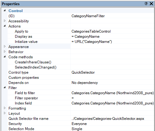
Quick Selector file name |
Specifies the location of the associated Quick Selector page.
|
||||||||||||||||||||||||||||||||||||||
|
Scope |
The portion of data included in the calculation. |
||||||||||||||||||||||||||||||||||||||
|
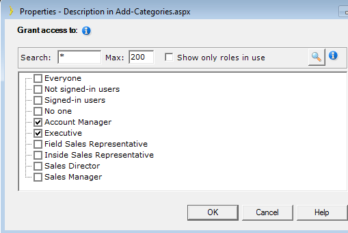
Security |
Any security roles configured for an individual field. Individual roles are separated by a semi-colon (‘;’). When you open security dialog it shows only already configured roles. So see all roles uncheck ‘Show only roles in use’ checkbox and click on magnifying glass button. When configured roles match roles of logged in user control is shown, otherwise it is hidden.
|
||||||||||||||||||||||||||||||||||||||
|
Selection mode |
Selection mode for the control: Single or Multiple items
|
||||||||||||||||||||||||||||||||||||||
|
SQL query |
The SQL query used to generate the panel’s displayed results
|
||||||||||||||||||||||||||||||||||||||
|
Time |
Time of day used when filtering. When using a date range filter on a Table Report page, the default time string used for the filter is 00:00:00 indicating 12 AM. This works well if you are comparing with the “Is greater than or equal to” operator since you want to display all records greater than equal to the date entered by the end user. For the “Is less than or equal to” operator, you can specify a default time string of 23:59:59 (11:59:59 PM). This allows the end user to enter a value for the To Date filter and retrieve all records that occur on or before the entered date.
|
||||||||||||||||||||||||||||||||||||||
|
Title |
The panel’s title displayed in the tab. Resource File Key You can also dynamically fetch a text string from your application’s resource file (RESX) at application run-time by specifying a Resource Key. This is useful in multi-language applications that have multiple resource files, one for each language. This permits easy application localization by editing your application’s resource file instead of the application itself. Specify the Resource Key in curly braces, e.g.: {Txt:MyTextString}
|
||||||||||||||||||||||||||||||||||||||
|
Treat other values as checked |
Specifies whether a check box field is displayed as selected when other values are encountered in the database. Check box fields can be displayed as either selected (checked) or unselected (unchecked). The “Checked value” and “Unchecked value” properties designate the database values that signify whether the check box should be selected. These are typically values such as ‘True’ and ‘False’ or ‘1’ and ‘0’. In some cases, the underlying database field may have values other than those specified by the “Checked value” and “Unchecked value” properties, e.g., the values may be ‘True’, ‘False’, and ‘Not Sure’.
If a hypothetical database column has a value of ‘Not Sure’, then the check box would be shown as checked if the “Treat other values as checked” property is set to ‘True’. The check box would be shown as unchecked if the “Treat other values as checked” property is set to ‘False.’
|
||||||||||||||||||||||||||||||||||||||
|
Unchecked value |
Specifies the value saved into the database when an unselected check box field is saved. “Unchecked value” is generally set to ‘No’. While “Unchecked value” can be set to anything, typical values are False, F, No, and 0.
|
||||||||||||||||||||||||||||||||||||||
|
URL |
The name of the primary key parameter passed in the URL and used to fetch a record to display.
|
||||||||||||||||||||||||||||||||||||||
