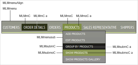
A multi-level menu is comprised of one or more menu items arranged either horizontally or vertically, with each capable of further displaying one or more levels of child submenus (leaves). The styles which control the look-and-feel of the menu are shown in the following figure:
For this example, we’ll only modify the default definitions (from the Vinho Verde page style) which specifically control the menu item/link text and submenu popup and link text:
.MLMmC { /* horizontal menu item container */
background-color: #000000;
font-family: 'PT Sans Narrow', Arial, Verdana, Georgia, sans-serif;
font-size: 16px;
padding: 4px;
}
.MLMmC a { /* horizontal menu item link text */
color: #fafafa;
text-decoration: none;
text-transform: uppercase;
}
.MLMmoC { /* horizontal menu item hover state */
background-color: #7f8e42;
}
.MLMmoC a, .MLMmoC a:hover { /* horizontal menu item hover state link text */
background-color: transparent;
}
.MLMmenusub { /* horizontal submenu container (menu leaves) */
opacity: 0.9;
}
.MLMsubmC { /* horizontal submenu item container */
background-color: #0a0a0a;
font-size: 11px;
padding: 6px;
text-align: left;
width: 100%;
}
.MLMsubmC a { /* horizontal submenu item link text */
color: #fafafa;
cursor: pointer !important;
font-family: Arial, Verdana, Georgia, sans-serif;
text-transform: uppercase;
}
.MLMsubmoC { /* horizontal submenu item hover state */
background-color: #7f8e42;
}
.MLMsubmoC a { /* horizontal submenu item hover state link text */
color: #fafafa;
}
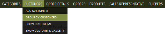
With these default definitions, the horizontal multi-level menu renders as:
Now let’s instead make the parent menu item’s background color a bright red (#ff0000) and its text black (#000000), and its hovered-over background color pink (#ffaaaa):
/* new definitions in Styles.css */
.MLMmC { /* horizontal menu item container */
background-color: #ff0000; /* override default attribute */
}
.MLMmC a { /* horizontal menu item link text */
color: #000000; /* override default attribute */
}
.MLMmoC { /* horizontal menu item hover state */
background-color: #ffaaaa; /* override default attribute */
}
For the submenu, let’s add black (#000000) borders, change its text links to black (#000000) and all non-capitalized (text-transform: none), its background color to a pink (#ffaaaa), and its hover text links to white (#ffffff):
/* new definitions in Styles.css */
.MLMmenusub { /* horizontal submenu container (menu leaves) */
border: 1px solid #000000; /* add new attribute */
}
.MLMsubmC { /* horizontal submenu item */
background-color: #ffaaaa; /* override default attribute */
}
.MLMsubmC a { /* horizontal submenu item link text */
color: #000000; /* override default attribute */
text-transform: none; /* override default attribute */
}
.MLMsubmoC { /* horizontal submenu item link text hover state */
background-color: #ffffff; /* override default attribute */
}
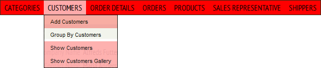
The customized multi-level menu renders as:
Customizing Style Sheets and Page Styles
Compendium of CSS Classes Used in Applications (Modern Themes)