A classic menu is comprised of one or more menu items arranged either horizontally or vertically, with each item further comprised of a clickable anchor link and nine edge images. The classic menu may also include two bookend images, and a bottom trim image.
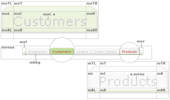
The following image shows a closeup of two “menu items” in a horizontal menu (in the Andes page style), one in highlighted or “active” state (i.e., the Customers “menu item” is set to an “active” green color to indicate to the application user they’re currently on the Show Customers page) and an “inactive” state (i.e., the Products “menu item” is an “inactive” off-white color on the same Show Customers page):
The following styles are used to render the highlighted or “active” menu items:
.moTL { /* horizontal menu highlighted item top right edge */
background-image:url(../Images/menuOverTL.gif);
width: 6px;
height: 5px;
}
.moT { /* horizontal menu highlighted item top center edge */
background-image:url(../Images/menuOverT.gif);
height: 5px;
}
.moTR { /* horizontal menu highlighted item top right edge */
background-image:url(../Images/menuOverTR.gif);
width: 6px;
height: 5px;
}
.moL { /* horizontal menu highlighted item left middle edge */
background-image:url(../Images/menuOverL.gif);
width: 6px;
height: 15px;
}
.moC { /* horizontal menu highlighted item center */
background-image:url(../Images/menuOverC.gif);
height: 15px;
white-space: nowrap;
width: 100%;
}
.moR { /* horizontal menu highlighted item right middle edge */
background-image:url(../Images/menuOverR.gif);
width: 6px;
height: 15px;
}
.moBL { /* horizontal menu highlighted item bottom left edge */
background-image:url(../Images/menuOverBL.gif);
width: 6px;
height: 3px;
}
.moB { /* horizontal menu highlighted item bottom center edge */
background-image:url(../Images/menuOverB.gif);
height: 3px;
}
.moBR { /* horizontal menu highlighted item bottom right edge */
background-image:url(../Images/menuOverBR.gif);
width: 6px;
height: 3px;
}
.moC a { /* horizontal menu highlighted item link text */
color: #666666;
font-family: Verdana, Geneva, ms sans serif;
font-size: 11px;
}
Note that each style specifies the path to the image used as an “edge” and the exact dimensions of that image.
Use your favorite image editor to recreate these nine “edge” images, replacing the ones in the “Images” folder of your application, then update their respective styles as necessary. E.g., if your new “edge” images differ in size to the default sizes, update their “width” and “height” attributes accordingly.
Repeat this process for the “inactive” menu items as governed by the following styles:
.mTL { /* horizontal menu item top right edge */
background-image:url(../Images/menuTL.gif);
width: 6px;
height: 5px;
}
.mT { /* horizontal menu item top center edge */
background-image:url(../Images/menuT.gif);
height: 5px;
}
.mTR { /* horizontal menu item top right edge */
background-image:url(../Images/menuTR.gif);
width: 6px;
height: 5px;
}
.mL { /* horizontal menu item left middle edge */
background-image:url(../Images/menuL.gif);
width: 6px;
height: 15px;
}
.mC { /* horizontal menu item center */
background-image:url(../Images/menuC.gif);
height: 15px;
white-space: nowrap;
width: 100%;
}
.mR { /* horizontal menu item right middle edge */
background-image:url(../Images/menuR.gif);
width: 6px;
height: 15px;
}
.mBL { /* horizontal menu item bottom left edge */
background-image:url(../Images/menuBL.gif);
width: 6px;
height: 3px;
}
.mB { /* horizontal menu item bottom center edge */
background-image:url(../Images/menuB.gif);
height: 3px;
}
.mBR { /* horizotnal menu item bottom right edge */
background-image:url(../Images/menuBR.gif);
width: 6px;
height: 3px;
}
a.menu { /* horizontal/vertical menu item link text */
color: #888888;
font-family: Verdana, Geneva, ms sans serif;
font-size: 11px;
padding-left: 3px;
padding-right: 3px;
text-decoration: none;
text-align: center;
width: 100%;
}
a.menu:hover { /* horizontal/vertical menu item link text hover state */
color: #666666;
}
Finally cap off your menu with two bookend images, and a bottom trim as specified as:
.mel { /* horizontal menu container left edge */
background-image:url(../Images/menuEdgeL.gif);
background-position: center right;
background-repeat: no-repeat;
width: 9px;
height: 23px;
}
.mer { /* horizontal menu container right edge */
background-image:url(../Images/menuEdgeR.gif);
background-position: center left;
background-repeat: no-repeat;
width: 9px;
height: 23px;
}
.mbbg { /* horizontal menu bottom trim */
}
Customizing Style Sheets and Page Styles
Compendium of CSS Classes Used in Applications