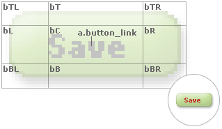
Application buttons are comprised of an HTML anchor link plus nine graphical pieces:
If you just need to change the clickable anchor link’s style, you can modify the “a.button_link” regular and hover styles defined in BaseStyles.css:
a.button_link { /* link text of buttons (including those within column headers and data grid) */
color: #888888;
font-family: Verdana, Geneva, ms sans serif;
font-size: 9px;
font-weight: bold;
text-decoration: none;
text-align: center;
padding-left: 4px;
padding-right: 4px;
width: 100%;
}
a.button_link:hover { /* link text of buttons (including those within column headers and data grid) hover state */
color: #666666;
text-decoration: none;
}
However, if you want to additionally change the look-and-feel of the button itself, you will need to recreate the nine “edge” (top-left, top, top-right, left, center, right, bottom-left, bottom, and bottom-right) images, and if necessary, update the styles which govern the positioning and size of those individual pieces. For example, the Andes page style’s button “edges” are defined as:
.bTL { /* theme button top left edge */
background-image:url(../Images/buttonTL.gif);
background-repeat: no-repeat;
background-position: bottom right;
width: 9px;
height: 4px;
}
.bT { /* theme button top center edge */
background-image:url(../Images/buttonT.gif);
background-repeat: repeat-x;
background-position: bottom center;
height: 4px;
}
.bTR { /* theme button top right edge */
background-image:url(../Images/buttonTR.gif);
background-repeat: no-repeat;
background-position: bottom left;
width: 15px;
height: 4px;
}
.bL { /* theme button left middle edge */
background-image:url(../Images/buttonL.gif);
background-repeat: no-repeat;
background-position: center right;
width: 9px;
height: 12px;
}
.bC { /* theme button center */
background-image:url(../Images/buttonC.gif);
height: 12px;
white-space: nowrap;
}
.bR { /* theme button right middle edge */
background-image:url(../Images/buttonR.gif);
background-repeat: no-repeat;
background-position: center left;
width: 15px;
height: 12px;
}
.bBL { /* theme button bottom left edge */
background-image:url(../Images/buttonBL.gif);
background-repeat: no-repeat;
background-position: top right;
width: 9px;
height: 8px;
}
.bB { /* theme button bottom center edge */
background-image:url(../Images/buttonB.gif);
background-repeat: repeat-x;
background-position: top center;
height: 8px;
}
.bBR { /* theme button bottom right edge */
background-image:url(../Images/buttonBR.gif);
background-repeat: no-repeat;
background-position: top left;
width: 15px;
height: 8px;
}
Note that each style specifies the (path to the) image to be used as an “edge”, whether or not that image is be be tiled horizontally (because the button’s anchor link is of variable length, the “top”, “center” and “bottom edge” images need to be tiled), and the exact dimensions of that image.
Use your favorite image editor to recreate these nine “edge” images, replacing the ones in the “Images” folder of your application, then update their respective styles as necessary. E.g., if your new “edge” images differ in size to the default sizes, update their “width” and “height” attributes accordingly.
Customizing Style Sheets and Page Styles