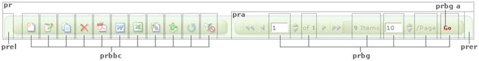
The button / pagination bar is comprised of various buttons which allow you to perform functions on the records shown within the data grid (e.g., create new, and edit/delete existing records), and to navigate among those records.
The textual content (current and total page text, total items text, and “Go” button link) can be customized by updating the style, “prbg”:
.prbg { /* pagination row button container */
background-image:url(../Images/ButtonBarBackground.gif);
background-repeat: repeat-x;
color: #666666;
font-family: Verdana, Geneva, ms sans serif;
font-size: 10px;
font-weight: normal;
padding-left: 3px;
padding-right: 3px;
white-space: nowrap;
}
The graphical elements within the button/pagination bar can also be replaced with your own versions. Basically, you will need to re-create each of the images in your application’s “Images” folder prefaced with “ButtonBar”. Specifically, the regular and rollover state button images for the following need to be created:
Button bar “new”, “edit”, “copy”, “delete, “export to Word”, “export to Excel”, “export as CSV”, “import”, “refresh”, and “reset”
pagination “first”, “previous”, “next”, “last
increment/decrement up and down arrows
button/pagination bar bookend images
Customizing Style Sheets and Page Styles