Iron Speed Designer offers about 20 different page types. Of those page types, four are designed for small-screen mobile smartphones; the remainders are for relatively large screen desktop computers. Throughout Iron Speed Designer, the two types of pages and their components are referred to as “Mobile” and “Web”.
Please be aware of these key points:
Iron Speed generates pages for use in Mobile phone web browsers. Iron Speed does not generate native apps.
Mobile and Web pages can coexist in the same application, which provides convenient sharing of data access code and customizations.
An application can have two start pages, one for Mobile and one for Web. When a mobile device is detected, the Mobile start page is served. Iron Speed’s testing has emphasized Safari on Apple iOS and Chrome on Google Android. However, Iron Speed may detect other major, mass-produced smartphones. To configure which devices get the Mobile start page, please refer to Setting the Start Page and Error Pages
All Modern and Classic page styles support Mobile.
Mobile supports multi-lingual applications, including right-to-left.
Mobile offers the same support as Web for: C#/VB code generation, role based security, and database servers. The code customization model is the same too.
Mobile applications support SharePoint. However, unlike Web pages, Mobile pages do not show the SharePoint server-specific menus and security elements.
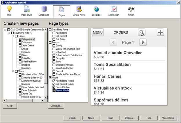
Adding Mobile pages to a new or even a migrated application is easy. Simply select a combination of the four mobile pages in the Application Wizard:
The Report Mobile page is a table page that points to the other three record pages:
Note the following differences compared to the larger Web pages:
Mobile pages are shown in a special Live Preview, which approximates the look and proportions of a mobile phone.
Filters and Sorts are in a separate pop down window.
Buttons are bigger.
Pagination is simplified.
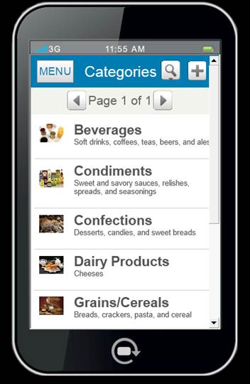
No more than three or four field values are shown for each record in the table.
If a field value is an image, it is shown on the left.
Pressing anywhere on a row goes to the corresponding Show Record page.
Because of the limited screen real estate on mobile phones, the mobile menu is shown in a separate page, which is the application’s Mobile start page:
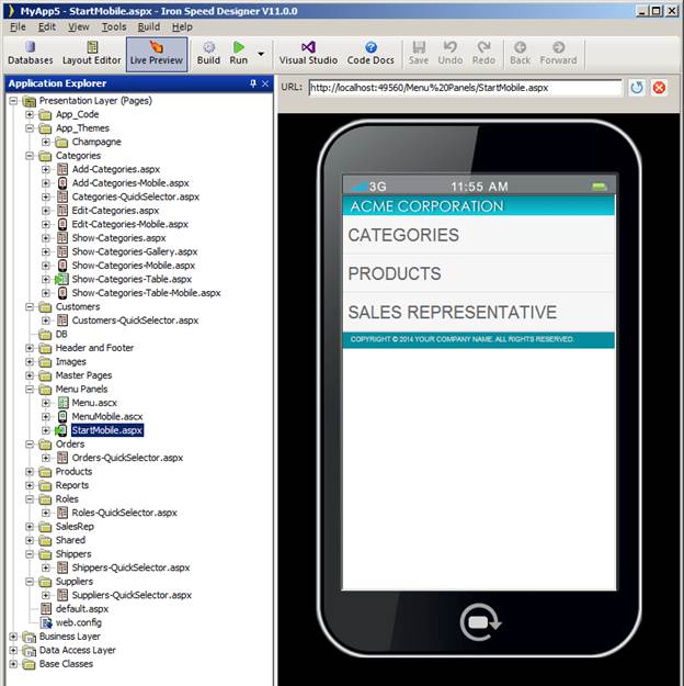
Pressing on any row takes the user to that table’s Mobile show table page. The settings button permits changing languages on multi-lingual applications.
Note that the Application Explorer tree shows special icons next to Mobile .aspx and .ascx pages. Mobile applications have their own dedicated headers, footers, menus, and, in many cases, components and error pages.
The following limitations are the result of usability requirements, limited mobile screen real estate, or browser-specific behavior:
File Upload on Apple iOS requires a 3rd-party native app. File Upload on Google Android may require installation of a memory card.
Because smooth panel updates did not work reliably on all firmware versions of our test devices, out-of-the-box Mobile pages do not use smooth panel updates.
Mobile pages do not use popup windows. Hence, there are no popup images, Charts drilldowns, or large list selectors).
Menus are single-level (no sub menus).
What is an Iron Speed Designer Application?
Creating Your First Application
Step 2: Select a Web Page Style
Step 3: Connect to a Database Server
Step 4: Select Pages to Generate
Step 5: Select Virtual Primary Keys and Virtual Foreign Keys
Step 6: Select Language and Localization Settings
Step 8: Build Your Application