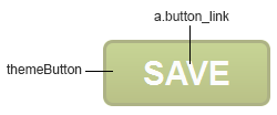
In Modern themes, the theme buttons are implemented via CSS3, each generally consisting of a background gradient bounding box, borders with round corners, and hyperlink text in the center:
/* existing definition in BaseStyles.css */
.themeButton { /* theme button wrapper */
background: -moz-linear-gradient( center top, #8ea82a 5%, #758410 100% );
background: -webkit-gradient( linear, left top, left bottom, color-stop(0.05, #8ea82a), color-stop(1, #758410) );
background: -ms-linear-gradient(top, #8ea82a 5%, #758410 100%);
border: 1px solid #5b660c;
border-radius: 3px;
display: inline-block;
filter: progid:DXImageTransform.Microsoft.Gradient(startColorStr='#8ea82a', endColorStr='#758410');
font-family: Arial, Verdana, Georgia, sans-serif;
font-size: 12px;
font-weight: bold;
padding: 3px 7px 3px 7px;
text-decoration: none;
white-space: nowrap;
}
.themeButton:hover { /* theme button wrapper hover state */
background: -moz-linear-gradient( center top, #758410 5%, #8ea82a 100% );
background: -webkit-gradient( linear, left top, left bottom, color-stop(0.05, 758410a), color-stop(1, #8ea82a) );
background: -ms-linear-gradient(top, #758410 5%, #8ea82a 100%);
border: 1px solid #fafafa;
color: #fafafa;
filter: progid:DXImageTransform.Microsoft.Gradient(startColorStr='#758410', endColorStr='#8ea82a');
-moz-transition: all 0.2s ease-in-out 0s;
white-space: nowrap;
}
a.button_link { /* link text of buttons */
color: #fafafa;
font-family: Arial, Verdana, Georgia, sans-serif;
font-size: 10px;
font-weight: bold;
padding-left: 4px;
padding-right: 4px;
text-align: center;
text-decoration: none;
text-transform: uppercase;
width: 100%;
}
a.button_link:hover { /* link text of buttons hover state */
color: #fafafa;
padding-left: 4px;
padding-right: 4px;
text-decoration: none;
}
To change the background gradient of the button, simply update the “start” and “end” colors (in this example, #8ea82a) and #758410, respectively) in each of the definitions below:
/* existing definition in BaseStyles.css */
.themeButton { /* theme button wrapper */
background: -moz-linear-gradient( center top, #8ea82a 5%, #758410 100% );
background: -webkit-gradient( linear, left top, left bottom, color-stop(0.05, #8ea82a), color-stop(1, #758410) );
background: -ms-linear-gradient(top, #8ea82a 5%, #758410 100%);
filter: progid:DXImageTransform.Microsoft.Gradient(startColorStr='#8ea82a', endColorStr='#758410’);
…
}
Note that the four gradient attributes account for the various browsers currently in use: “-moz-linear-gradient” for Firefox, “-webkit-gradient” for Chrome and Safari, “-ms-linear-gradient” for IE10, and “filter: progid” for IE8-9.
For example, let’s make the button reddish instead (with “start” color #c91212, and “end” color #8e1f1f):
/* new definition in Styles.css */
.themeButton { /* theme button wrapper */
background: -moz-linear-gradient( center top, #c91212 5%, #8e1f1f 100% ); /* override default attribute */
background: -webkit-gradient( linear, left top, left bottom, color-stop(0.05, #c91212), color-stop(1, #8e1f1f) ); /* override default attribute */
background: -ms-linear-gradient(top, #c91212 5%, #8e1f1f 100%); /* override default attribute */
filter: progid:DXImageTransform.Microsoft.Gradient(startColorStr='# c91212, endColorStr='#8e1f1f’); /* override default attribute */
…
}
You may also change the button’s border color to dark gray (#333333), and increase its roundedness (to 8px):
.themeButton { /* theme button wrapper */
border: 1px solid #333333; /* override default attribute */
border-radius: 8px; /* override default attribute */
…
}
Finally, you can change the button’s link text to yellow (#ffff00) and to not be all uppercase (text-transform: none;):
/* new definition in Styles.css */
a.button_link { /* link text of buttons */
color: #ffff00; /* override default attribute */
text-transform: none; /* override default attribute */
…
}
The resultant theme button then looks like this:

Customizing Style Sheets and Page Styles
Compendium of CSS Classes Used in Applications (Modern Themes)